
By Jeremy Hamann, Jr. Art Director
Brandtailers’ Design Download Series explores recent trends in graphic design and the role of AI in art. In this post, our Art Director Jeremy Hamann details some of the good, and not so good, trends we’ve been seeing in the design world recently. Enjoy!
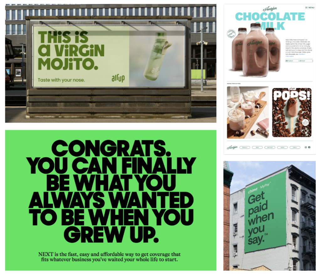
Big Ol’ Headlines, Itty Bitty Copy
We’ve been seeing a lot of this lately, mostly from brands trying to present a modern, friendly, “I’m not your soulless mega-corporation” vibes.
Cranking up the hierarchy dial up to 11, the strategy is basically to have a huge main message/brand personality displaying phrase and then contrasting tiny supporting copy.
Though it does become a part of a brand style in general oftentimes, it shows up a lot in OOH and web, which makes practical sense where you really want to get your message across to the audience as they’re driving/scrolling by.
Fluorescents
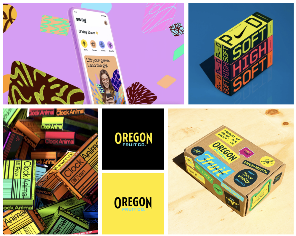
Over the last decade, color has been working its way more and more into brand identities, but lately companies have not been afraid of going full fluorescent.
This may be an attempt to catch the attention of the Gen-Z market, but design-wise brands still need to be careful on their color selection. I love a bold color palette, but if everything is a vibrant color, legibility could suffer, and colors could vibrate (that Oregon Fruit Co. blue on yellow is rough).
Gradients
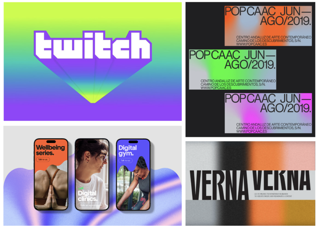
Gradients got a bad wrap a few years back, and when used poorly it really cheapens a design.
However, lately gradients have gotten a glow-up, but utilizing new shapes, texture, different techniques, and a variety of colors, these hombres add life and variety to what could otherwise just be a flat background or brand pattern.
Gradients aren’t always the answer, but it’s nice to have a tool back in our belt!
Collage
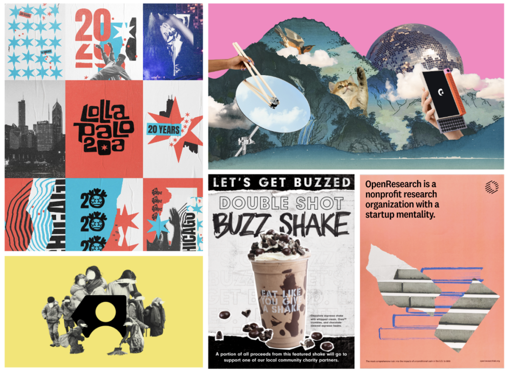
The 90’s are back, baby! Different brands have been utilizing collage-inspired imagery. Where this trend stands out is that it can be utilized by lots of different industries to evoke different moods. From music festivals to tech to non-profits, collage can be used and personalized to many different kinds of brands to make unique, custom brand imagery.
Get Funky
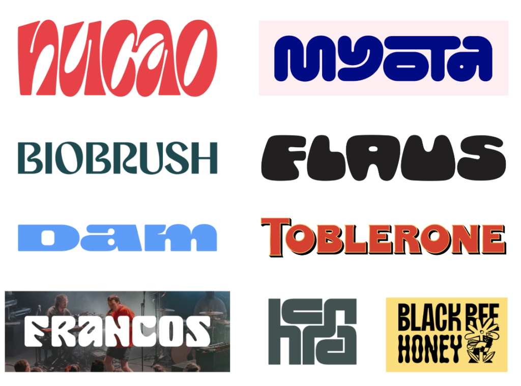
The 2010’s were marked by a slew of safe, non-polarizing logos featuring legible, minimal geometric sans-serifs. Maybe influenced by the widespread move toward the digital space and wanting to make new platforms and technologies more approachable and understandable, unfortunately companies lost the desire to inject any kind of personality in their brand.
Well, brands are finally willing to evolve past that and are embracing organic forms and abstraction once again. Though there still is a time and place for geometric sans-serifs, more and more brands are showing their personality and story, trusting that the general population is smart enough to figure out what they’re saying, and happy to have a little more fun along the way.
Illustrious Illustration
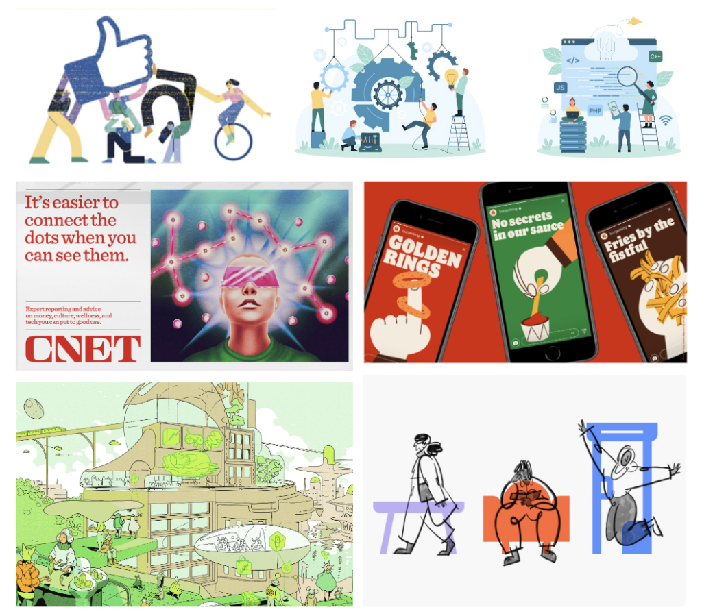
A style of corporate illustration has been king for some time: faceless people doing something abstract that somewhat fits with what the company does. It’s easily replicated and options abound on Adobe Stock. But that’s just what it is: stock.
Committing to a more ambitious illustrative style is an investment, for sure. But more and more companies have been hiring illustrators with a specific style they feel captures the personality of their brand to create a bunch of spot illustrations that can be used across deliverables. More expensive? Yes. Harder to work with more limited assets? Maybe. Worth having a unique voice in a sea of POP and OOH? I’d say so.
Hard Flash
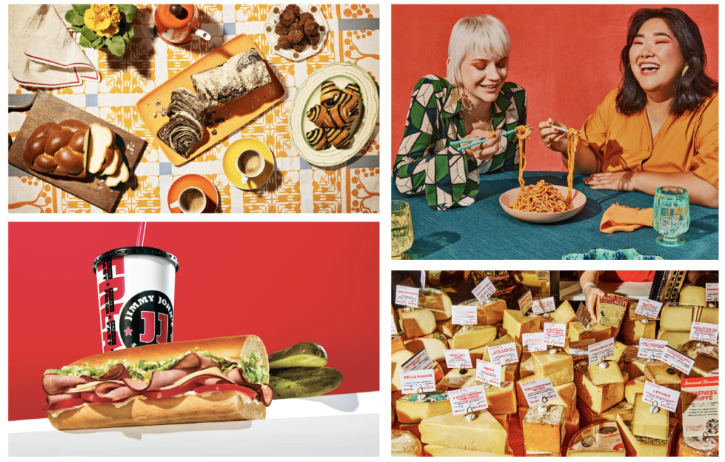
Brands have been loving their Hard Flash aesthetic the last few years. It seems like this photography style is being adopted by all kinds of brands.
The Hard Flash look undoubtedly creates drama and pairs nicely with a vintage, faux-film aesthetic that communicates authenticity and relatability. It also has an edge to it that could be targeted to catch the attention of the all-important Gen Z audience.
If I had to guess, though, I’d say this style is getting same-y and may lead brands to either keep capitalizing on the trend until it is dead or exploring another look to stand out from the rest of the landscape.
By Jeremy Hamann, Jr. Art Director


Big Ol’ Headlines, Itty Bitty Copy
We’ve been seeing a lot of this lately, mostly from brands trying to present a modern, friendly, “I’m not your soulless mega-corporation” vibes.
Cranking up the hierarchy dial up to 11, the strategy is basically to have a huge main message/brand personality displaying phrase and then contrasting tiny supporting copy.
Though it does become a part of a brand style in general oftentimes, it shows up a lot in OOH and web, which makes practical sense where you really want to get your message across to the audience as they’re driving/scrolling by.

Fluorescents
Over the last decade, color has been working its way more and more into brand identities, but lately companies have not been afraid of going full fluorescent.
This may be an attempt to catch the attention of the Gen-Z market, but design-wise brands still need to be careful on their color selection. I love a bold color palette, but if everything is a vibrant color, legibility could suffer, and colors could vibrate (that Oregon Fruit Co. blue on yellow is rough).

Gradients
Gradients got a bad wrap a few years back, and when used poorly it really cheapens a design.
However, lately gradients have gotten a glow-up, but utilizing new shapes, texture, different techniques, and a variety of colors, these hombres add life and variety to what could otherwise just be a flat background or brand pattern.
Gradients aren’t always the answer, but it’s nice to have a tool back in our belt!

Collage
The 90’s are back, baby! Different brands have been utilizing collage-inspired imagery. Where this trend stands out is that it can be utilized by lots of different industries to evoke different moods. From music festivals to tech to non-profits, collage can be used and personalized to many different kinds of brands to make unique, custom brand imagery.

Get Funky
The 2010’s were marked by a slew of safe, non-polarizing logos featuring legible, minimal geometric sans-serifs. Maybe influenced by the widespread move toward the digital space and wanting to make new platforms and technologies more approachable and understandable, unfortunately companies lost the desire to inject any kind of personality in their brand.
Well, brands are finally willing to evolve past that and are embracing organic forms and abstraction once again. Though there still is a time and place for geometric sans-serifs, more and more brands are showing their personality and story, trusting that the general population is smart enough to figure out what they’re saying, and happy to have a little more fun along the way.

Illustrious Illustration
A style of corporate illustration has been king for some time: faceless people doing something abstract that somewhat fits with what the company does. It’s easily replicated and options abound on Adobe Stock. But that’s just what it is: stock.
Committing to a more ambitious illustrative style is an investment, for sure. But more and more companies have been hiring illustrators with a specific style they feel captures the personality of their brand to create a bunch of spot illustrations that can be used across deliverables. More expensive? Yes. Harder to work with more limited assets? Maybe. Worth having a unique voice in a sea of POP and OOH? I’d say so.

Hard Flash
Brands have been loving their Hard Flash aesthetic the last few years. It seems like this photography style is being adopted by all kinds of brands.
The Hard Flash look undoubtedly creates drama and pairs nicely with a vintage, faux-film aesthetic that communicates authenticity and relatability. It also has an edge to it that could be targeted to catch the attention of the all-important Gen Z audience.
If I had to guess, though, I’d say this style is getting same-y and may lead brands to either keep capitalizing on the trend until it is dead or exploring another look to stand out from the rest of the landscape.